Sunrise Senior Living

Senior care
Sunrise Senior Living provides senior care services including assisted living, independent living, and memory care in communities across the US, Canada, and the UK.
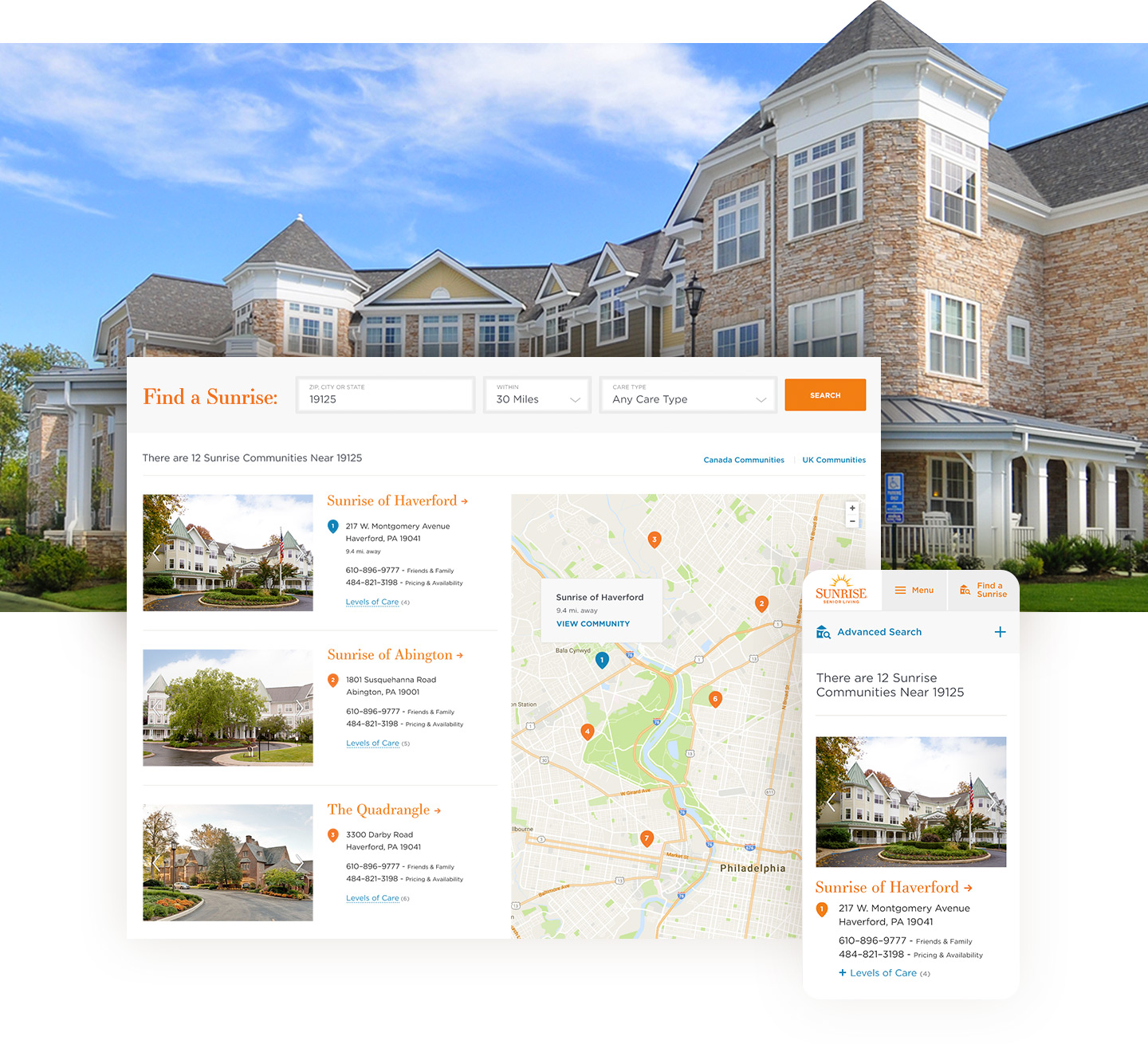
I have worked on a large range of projects for this client over a span of seven years. The latest was an optimization project that included a site restructure, improvements to the user journey, and redesigns of the home page, the community search page and the care pages.
Personalized care, personalized site
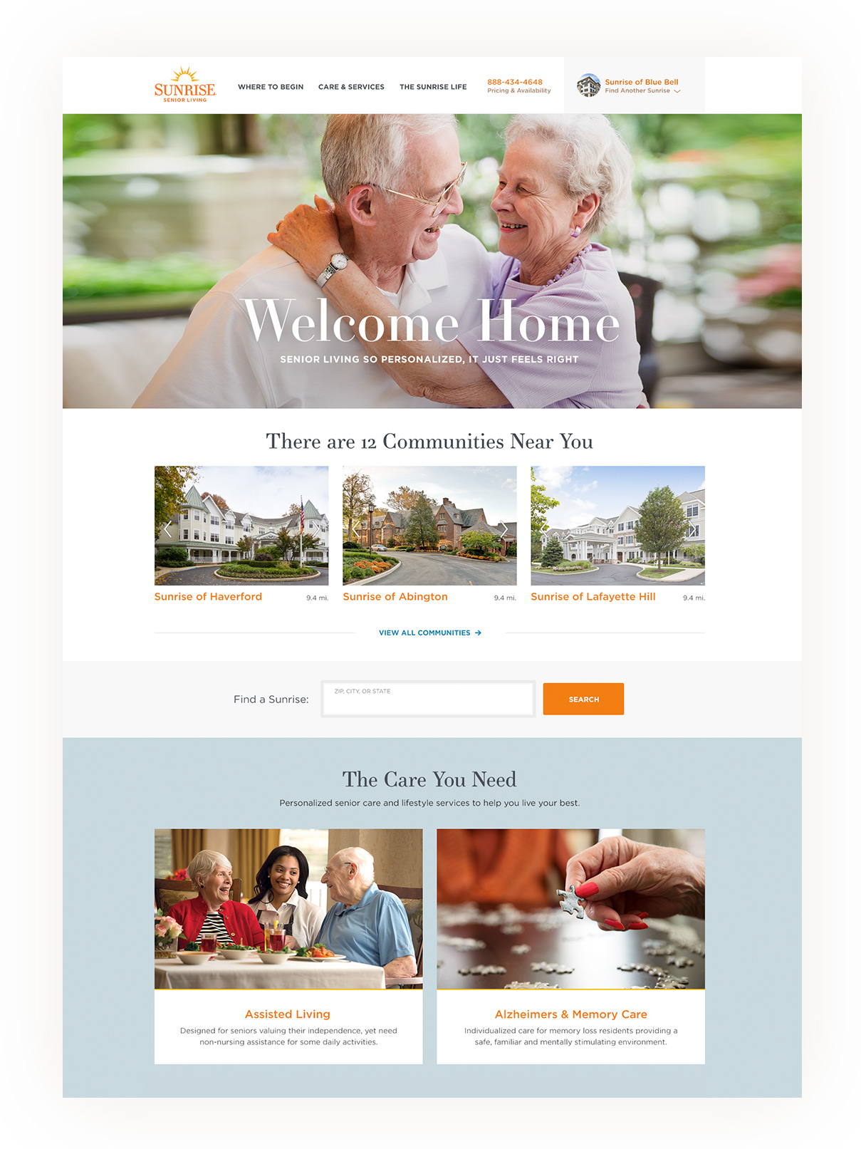
The site included areas of personalization that could deliver targeted, relevant content to visitors based on their behavior. For example, if the visitor took the Care Questionnaire and determined they needed Assisted Living, the home page banner would then display Assisted Living messaging. Additionally we included geolocation to display the user’s nearby communities without needing to perform a search.
The state of the header
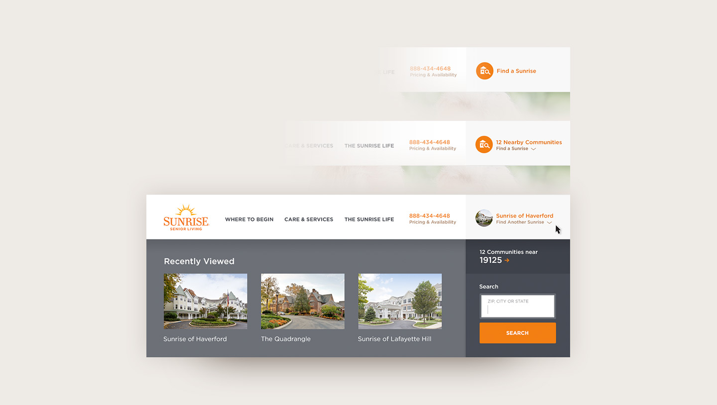
The main header included logic for multiple states. The first (from the top) – a non-geolocated state that prompts users to Find A Sunrise. The second – a geolocated state lets users know how many communities are nearby. Finally the third state displays the last community that was viewed, plus the three latest viewed communities inside a drawer. For the users that are just beginning their journey to find a community, this drawer offers an easy way to navigate back and forth while comparing options. When a user commits to a community (for example when their senior parent moves in), that community page will always be a click away in the header, negating the need to search for it each time and allowing easy navigating between the community page and the main sunrise site.
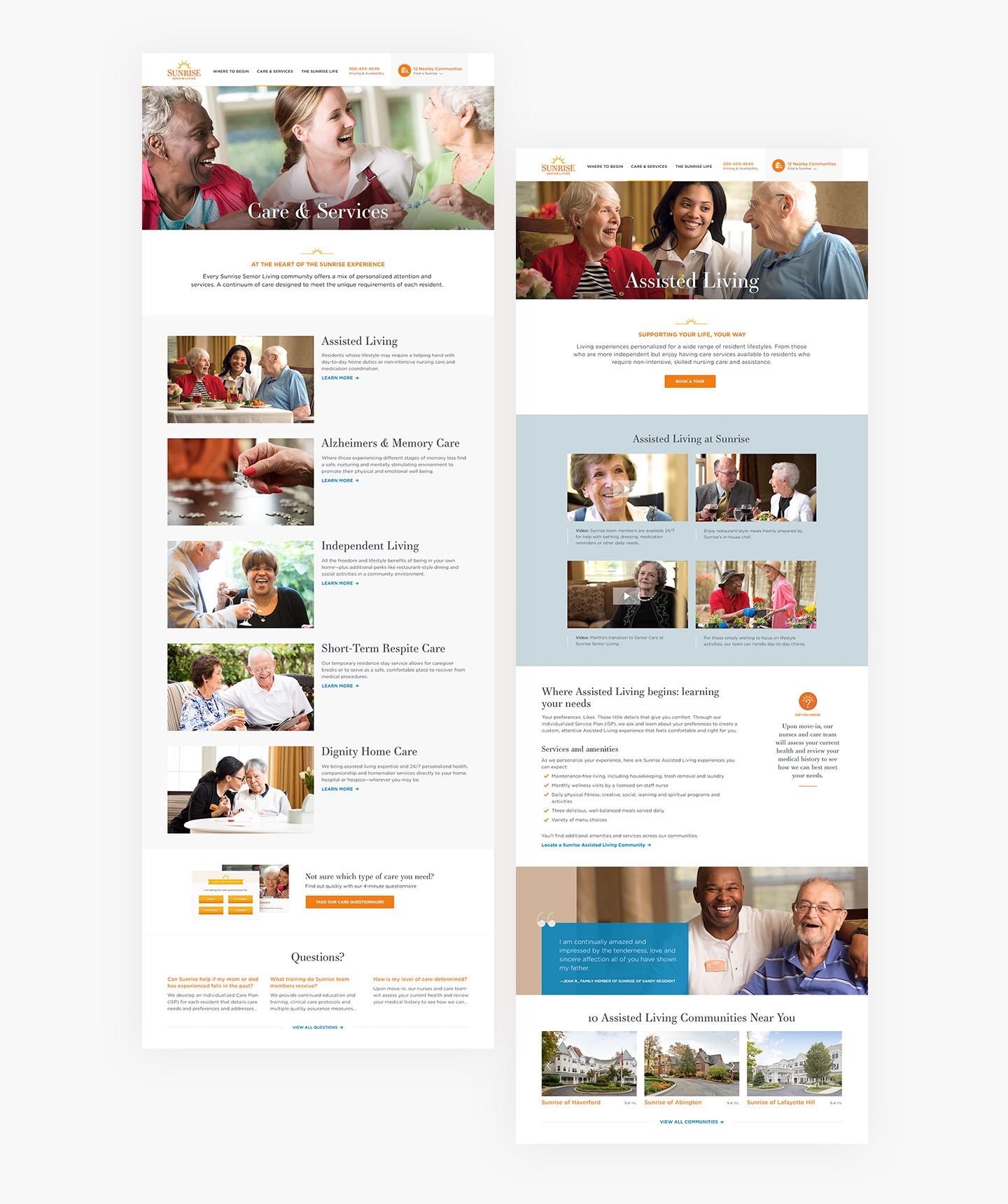
All about care
Through a user survey, we learned that the biggest hurdle in finding senior care was determining what type of care is needed. Even users who thought they selected correctly were often wrong. To solve this issue, we developed the Care Questionnaire, a quick survey of questions that tells the user what care they need based on their answers. Their result follows them throughout the site in personalized content areas.
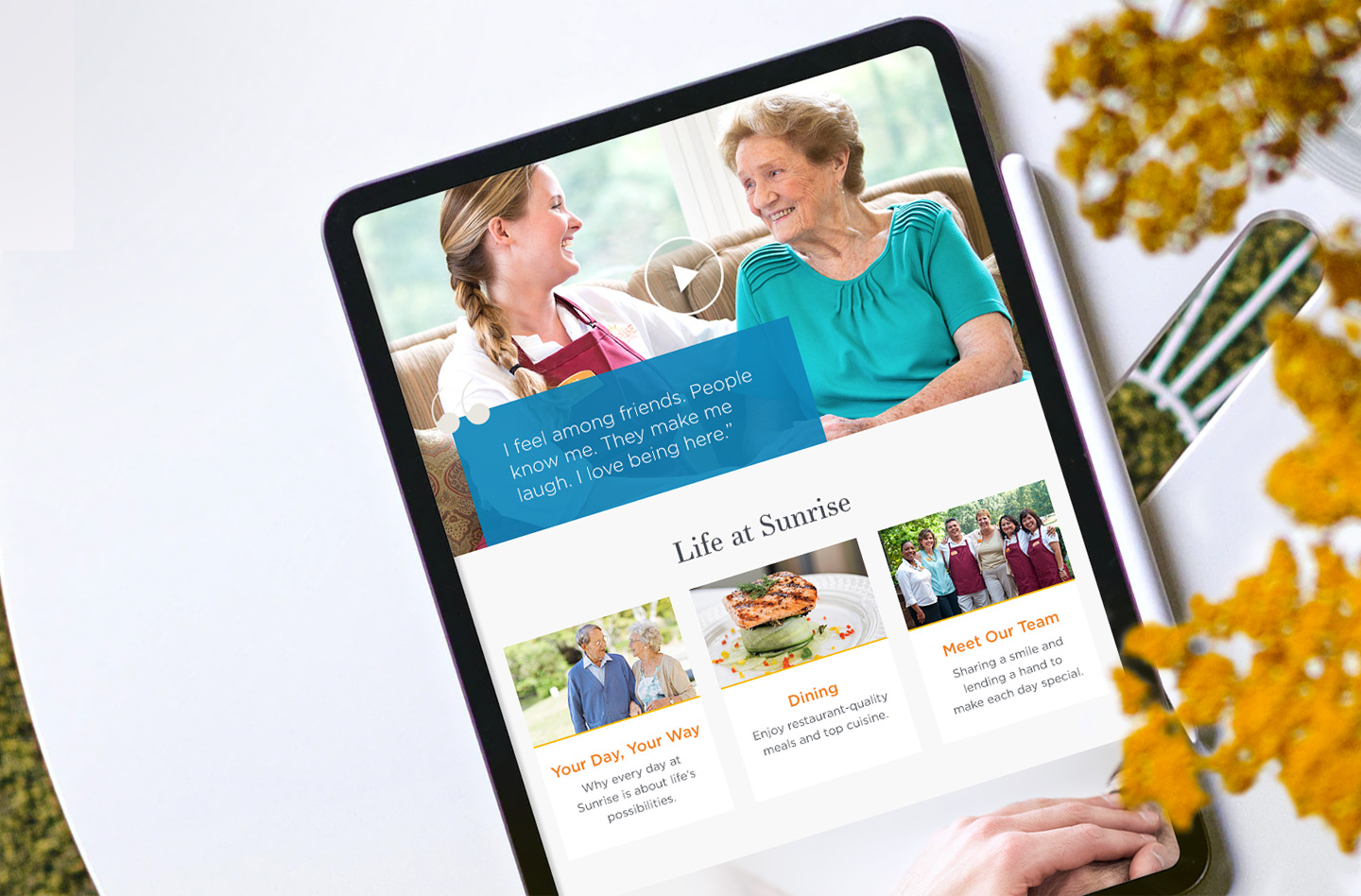
Understanding that finding senior care can be a difficult decision often filled with guilt, we wanted the user journey to feel simple, filling the users with confidence in their decision to choose Sunrise. We sprinkled in frequently asked questions to display answers to questions the user might not have even thought of. On the care pages, we aimed to visually show users what life is like at Sunrise with photographs and video stories and testimonials. There were spots for “Did You Know” facts and care level resources (such as How To Tell The Difference Between Normal Forgetfulness And Dementia).


