American Standard
Iconic, dependable, fresh
Known as a leader in affordable design, American Standard wanted to reposition themselves as a design and lifestyle brand. Their goal was to expand beyond bathrooms while also ensuring that their iconic brand could reach a younger, style-focused customer.
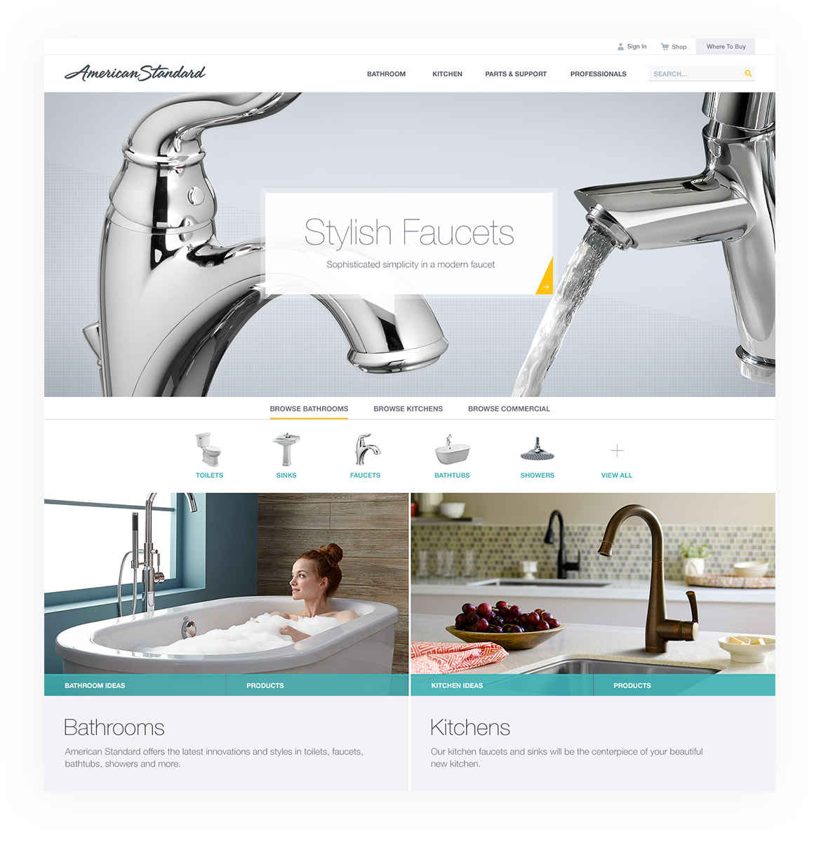
From catalog to wow
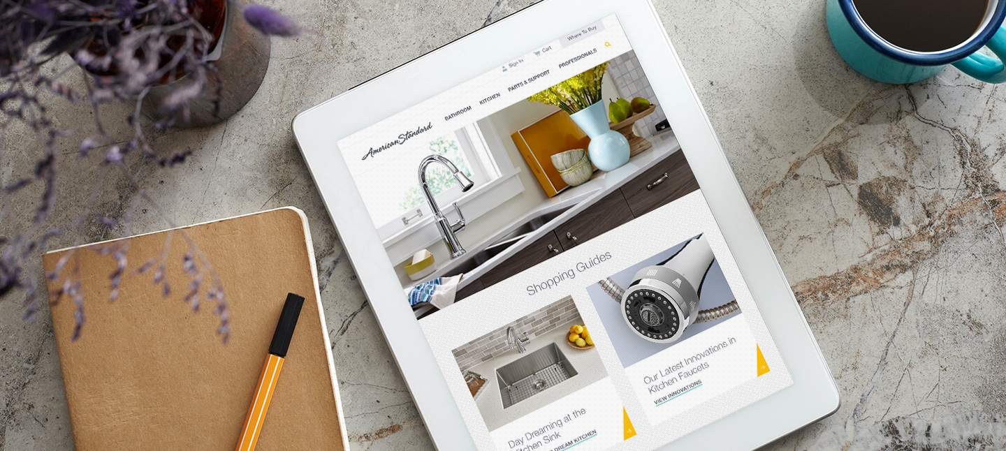
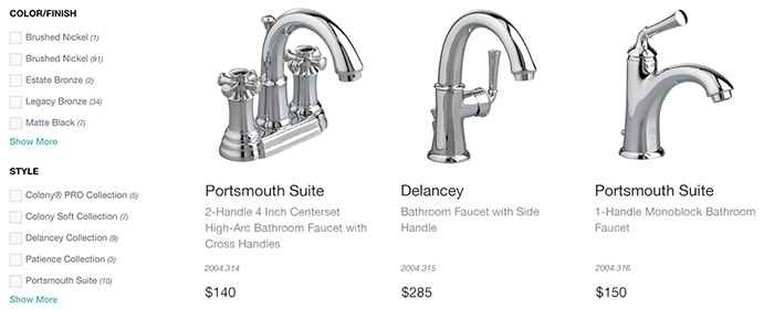
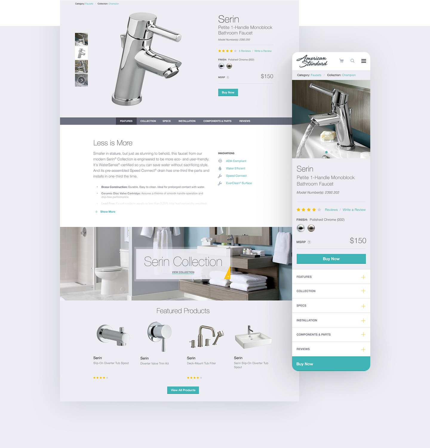
The original website was set up more like a technical catalog, but didn’t have the sleek, modern aesthetics characteristic of design experts. By incorporating more lifestyle images and showcasing design collections, we wanted to change the perception of American Standard being just a toilet company to being a more design-focused home fixtures company.

Keeping it professional
Originally American Standard had separate sites for Professionals. We merged the existing pro sites with the new consumer site, to create one branded experience for every audience.
The single website is now personalized based on who is viewing it. Once a user identifies themselves as a pro, the back end serves up different marketing messages and site components specifically geared towards them.
This delivers a more relevant shopping experience to the professional customer base.
Inspiring collections
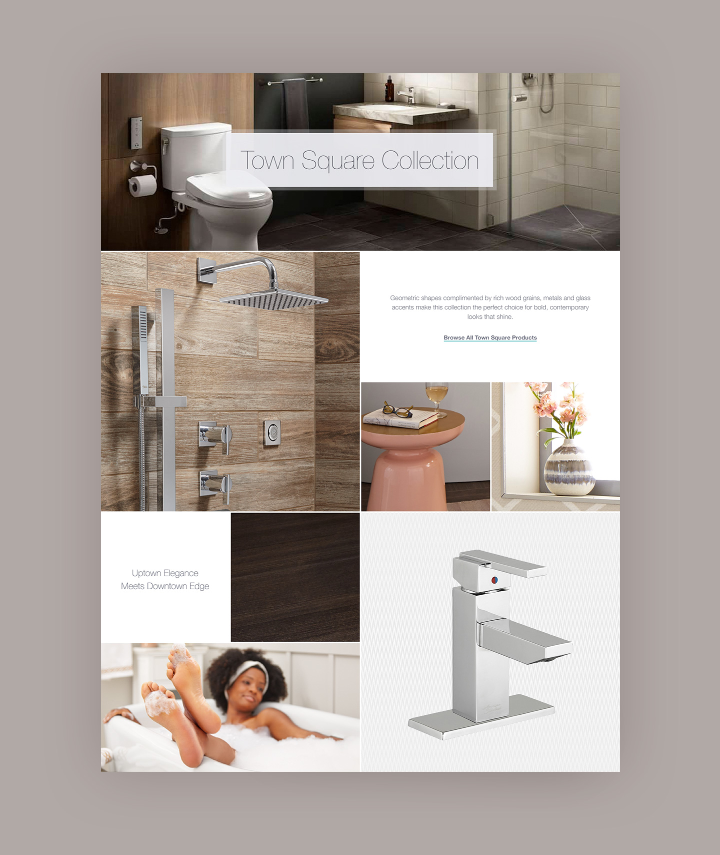
We dedicated a section of the site for Collections. The design highlighted the components of a bathroom or kitchen in a way that’s easy for a user to understand how to put together a similar look on their own.
